Build it once. Use it everywhere.
A block is a template your data renders through. A component is a real custom element with its own state. You write both in the admin, with a live preview beside you, and neither needs a build step.
Your markup, your data, every row.
Write the HTML for one item. Put the field names in double braces. Point a collection at it and every entry comes out in that shape.
[collection slug="team" display="block" block="profile-card" cols="3" /]
{{field}} - escaped, safe by default{{{field}}} - raw HTML, for fields that hold markup{{_createdAt:DD MMM YYYY}} - dates formatted inline_id, _createdAt, _updatedAt available on every entryThe same block= attribute works on the carousel and list-group displays, so one template can be a grid on one page and a carousel on another.
CSS that cannot leak.
Each block carries its own stylesheet, and you write the rules without the wrapper selector. The server scopes them for you.
/* you write this */
.role { color: var(--dm-text-muted); }

/* the page gets this */
[data-block="profile-card"] { .role { … } }
So two blocks can both style .title and neither touches the other - and neither touches the rest of your page.
One-off content, same template.
Not everything deserves a collection. `
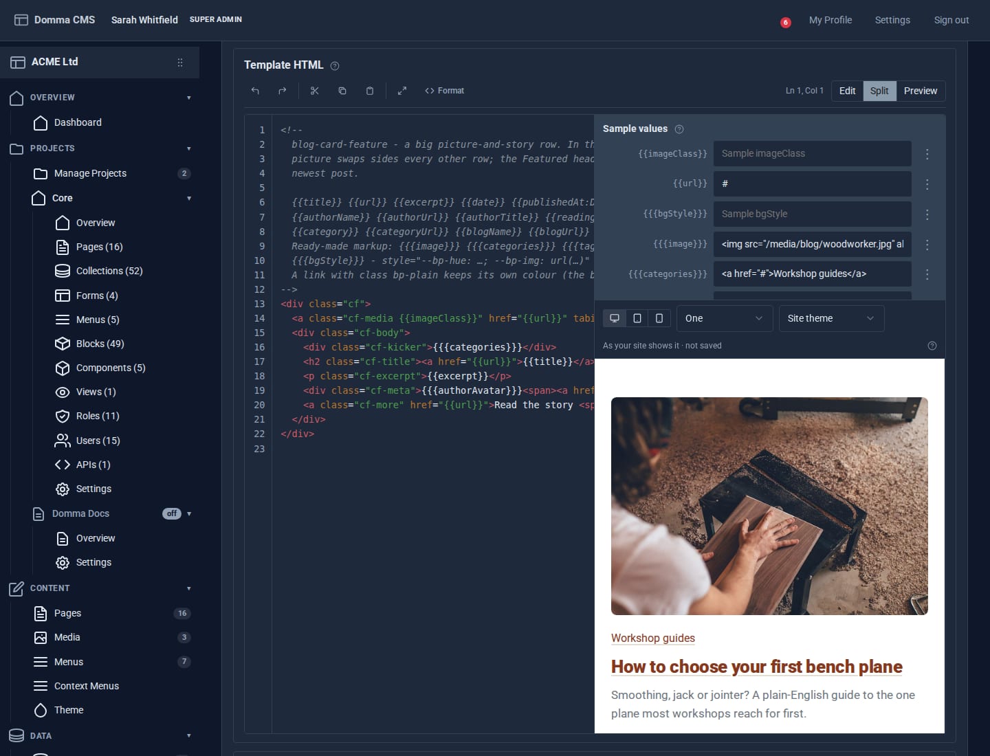
Split mode: the template, a sample value for every placeholder, and the block drawn inside your own site - its theme, fonts and Custom CSS - redrawn as you type. Switch to tablet or phone width, three in a grid, or another theme.
A real element, not a snippet.
A component is one file with four parts - template, props, script, style - and it compiles to a custom element with its own shadow DOM.
[component name="counter" initial="10" step="5" show-reset="true" /]
That goes straight in your page, next to your Markdown. No import, no registration, no bundle. Write <dm-counter initial="10"></dm-counter> instead if you prefer the tag - both are the same thing.
{{prop}} and {{#if}} in the templatethis.set({…}) for state; the element re-renders itselfOnly the components a page actually uses get their script sent to the browser. Twenty components on the site costs a page that uses one exactly one.
The preview is the component.
The editor gives you the four source tabs and a live instance running beside them. The props panel is generated from what you declared, so changing a default and seeing the result is one click, not a save-and-refresh.
Insert it without remembering the name.
In the page editor, Insert Component opens a gallery, fills a form from the component's props, previews the result, and writes the tag at your cursor.
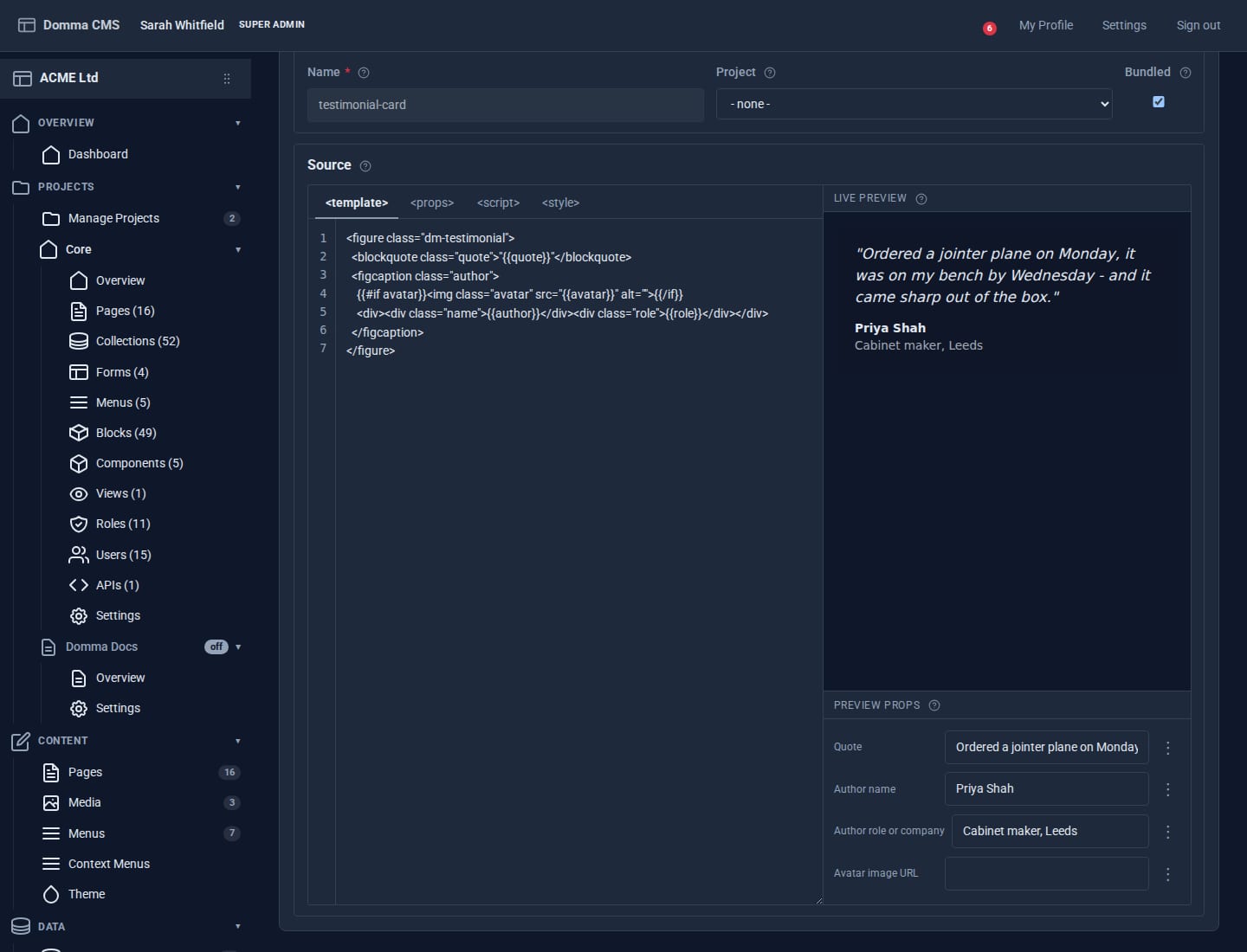
Four source tabs and a real instance running beside them, with the props panel built from what the component declares.
What they share.
Both editors render what you are writing as you write it. The block editor invents sample data from the placeholders it finds, so a brand-new template shows something on the first keystroke.
Export any block or component as a single file and import it somewhere else. Styles and metadata travel with it. Build a house style once and carry it across every site you run.
Tag either one to a project and it sits with the rest of that project's work, out of the way of everything else on the site.